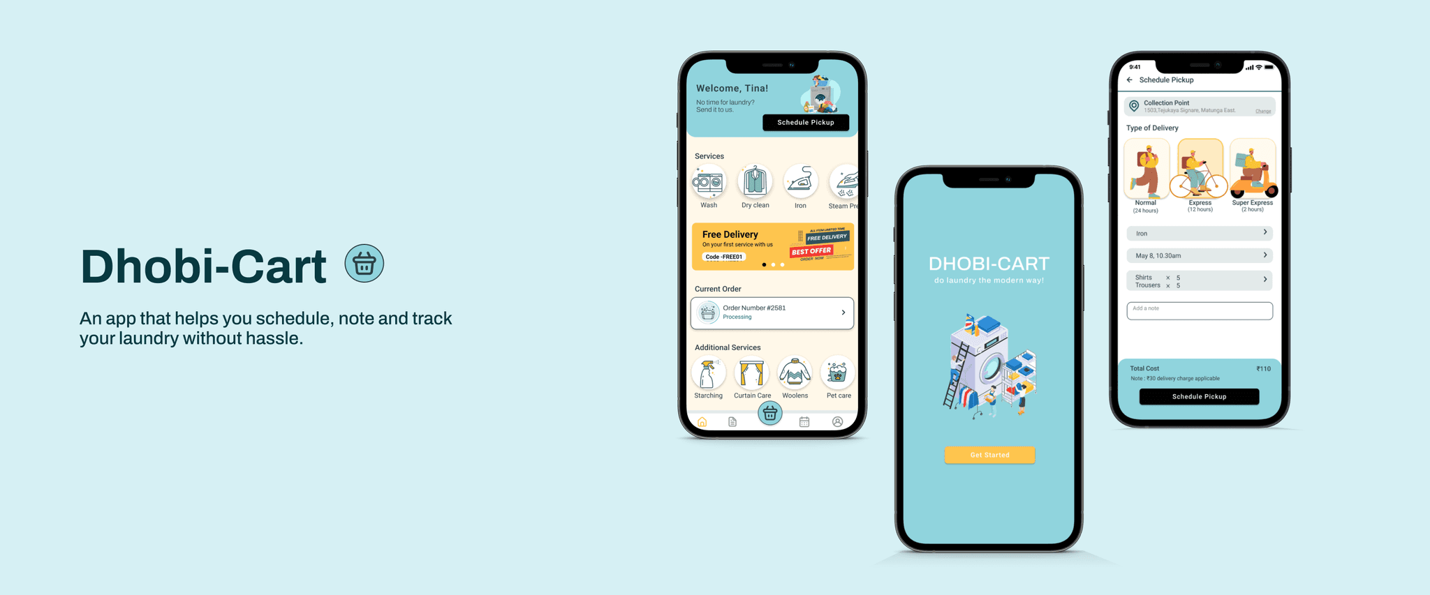
Dhobi-Cart 🧺
Solving the problem of tracking daily laundry services and bills.
As this was a personal project, I took on the roles of both researcher and designer. I conducted comprehensive user research to gather insights and directly applied those findings to create and refine the design.
Type
Kaarwan Design
School Certification
Team
1 Designer
Tools
Figma, Miro, Photoshop, Illustrator
Duration
1 month
(Apr - May '22)
Product
Mobile Application
Problem
Services like laundry and dry-cleaning are time consuming. Most of the times the end result is not as desired. In the busy schedule, keeping clothes clean and ready to wear is difficult. Outsourcing of these services has become very common in India, however we rely on our laundry walas (guy) memory to keep a tab of the bills and the clothes by the end of the month.
More than 50% users rely on the laundry man’s memory to keep tab of laundry and the bills.
Solution
Creating a platform for the local laundry shop that allows the users as well as the client to keep a track of the laundry and book slots for urgent pickup or special services.
Dhobi-cart: A tool that helps you schedule, note and track your laundry without hassle.

Process
Why did I build this?
In India, laundry market is huge and also very unorganized and every city, town and even community have a local laundry service that they rely on. Trust plays a very important factor in this whole process. I picked up this problem space to understand the motivations and give user some power to have the trust factor stay intact.
Secondary
Research
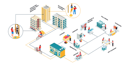
Understanding the laundry system in major cities like Mumbai was crucial. The system of a laundry shop was studied to comprehend all the activities because the local market is very large. Having a designated laundry "wala" who is in charge of all necessary services was typical in communities. Three residential buildings worked by a single laundry wala were examined.
2/3 households outsource their laundry services on daily basis.
Competitive Analysis
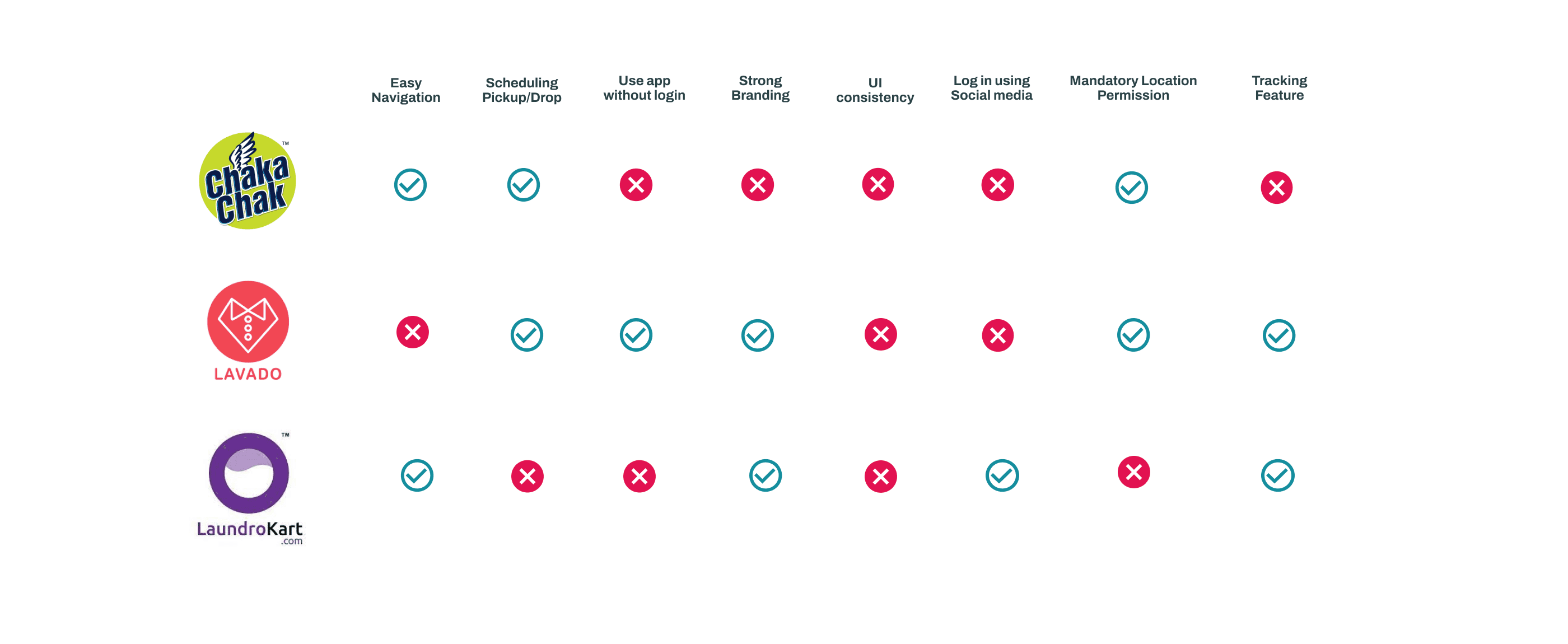
To understand the user experience of booking services, I analyzed three existing applications. By comparing the experiences of new and returning customers and reviewing Play Store comments, I identified key challenges.
Existing products addressed some of the pain points, but no one product did it all.
User Research
To better understand the problem, a 50 people survey and 5 interviews were conducted with users.
Interview Questions asked —
How often do you pay your laundry bills?
How do keep a tab of clothes given for laundry?
What is your motivation to outsource laundry?
What kind of Laundry services do you need?
Which laundry service do you use?
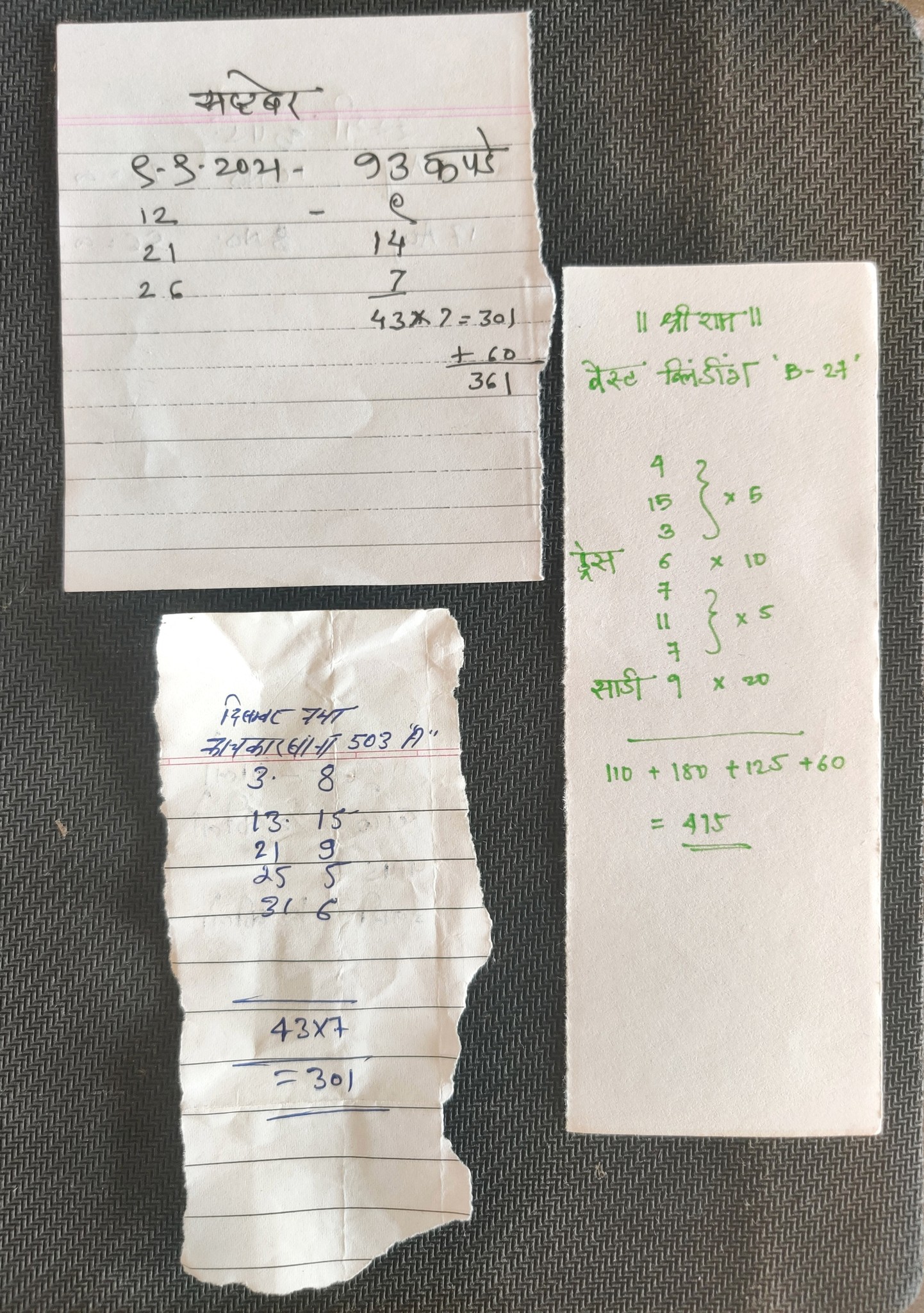
Laundry Bills
Typical laundry bill given by local laundry shop.
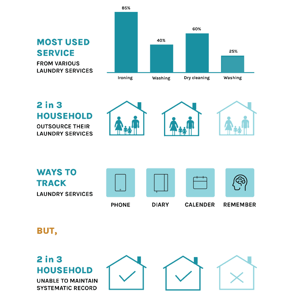
Inferences
User Persona
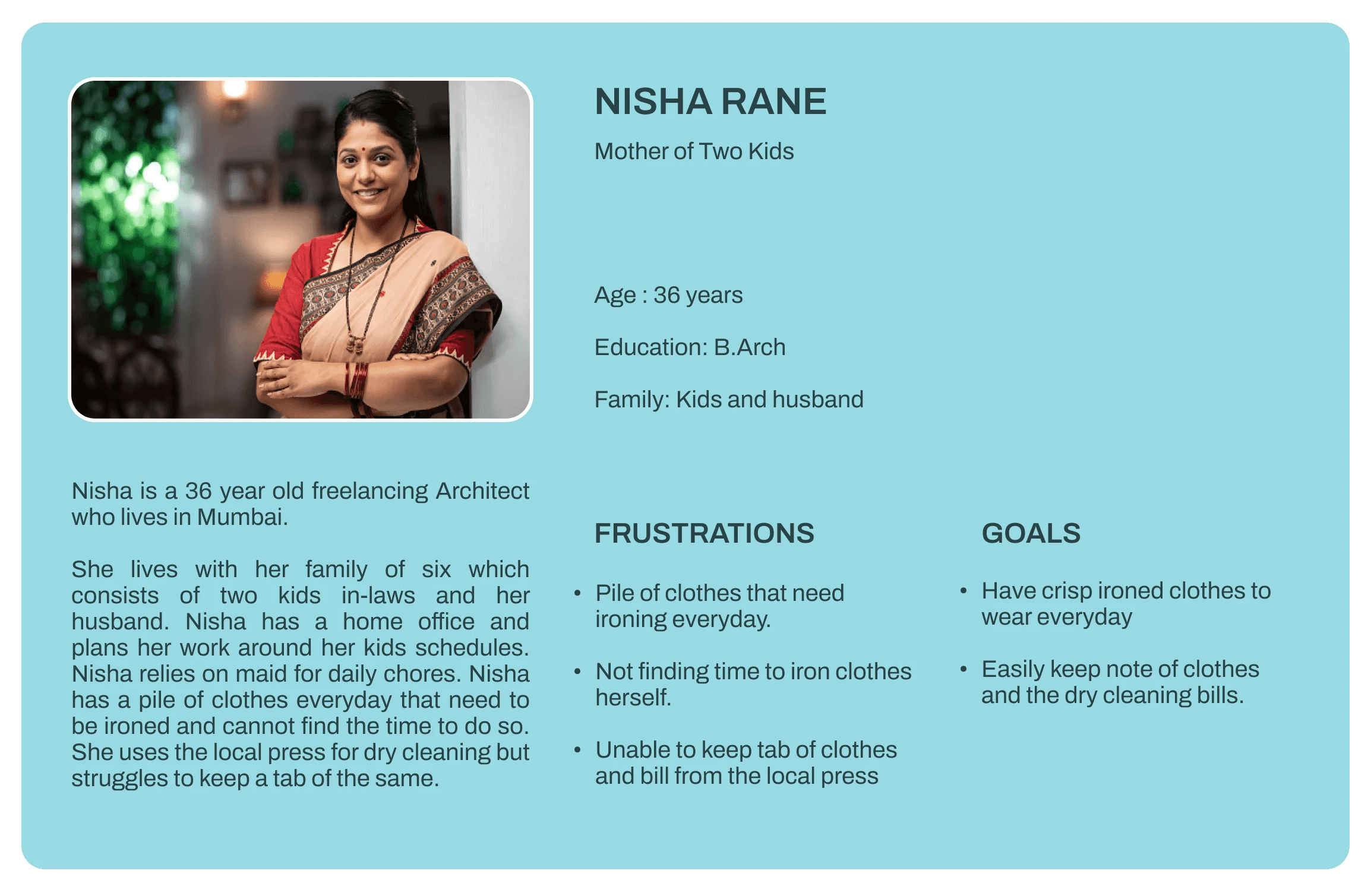
To better understand our target audience, I created a detailed user persona. This persona informed our design decisions, ensuring that the product met their specific needs
User Journey
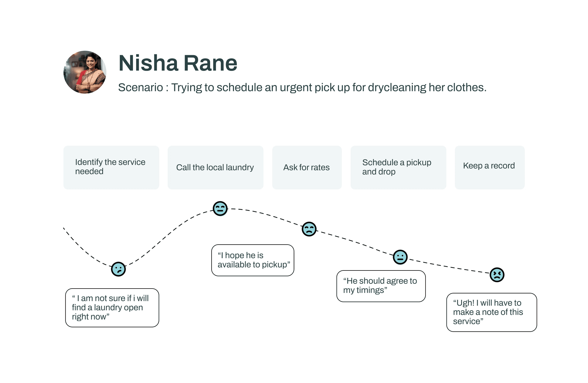
To gain a deeper understanding of the user experience, I conducted a user journey mapping exercise for the existing laundry scheduling service
Main Finding
The most frequently mentioned theme in the surveys and interviews was the challenge of managing laundry for busy individuals.
Busy individuals need a reliable laundry service that offers personalized scheduling and tracking to save time and ensure they always have clean clothes.
MVP
To manage the project's growing scope and ensure efficient resource allocation, I prioritized essential features by creating an MVP (Minimum Viable Product) list.
Must Have
List of services
Rate card
Scheduling Option
Calendar that keeps a record
Notifications
Should Have
Discount and Offers
Address Book
Online Payment
Tracking
Could Have
Call to Schedule
Wallet
Subscription
Tips for care
Reminders
Won't Have
Selling Items
Live Tracking
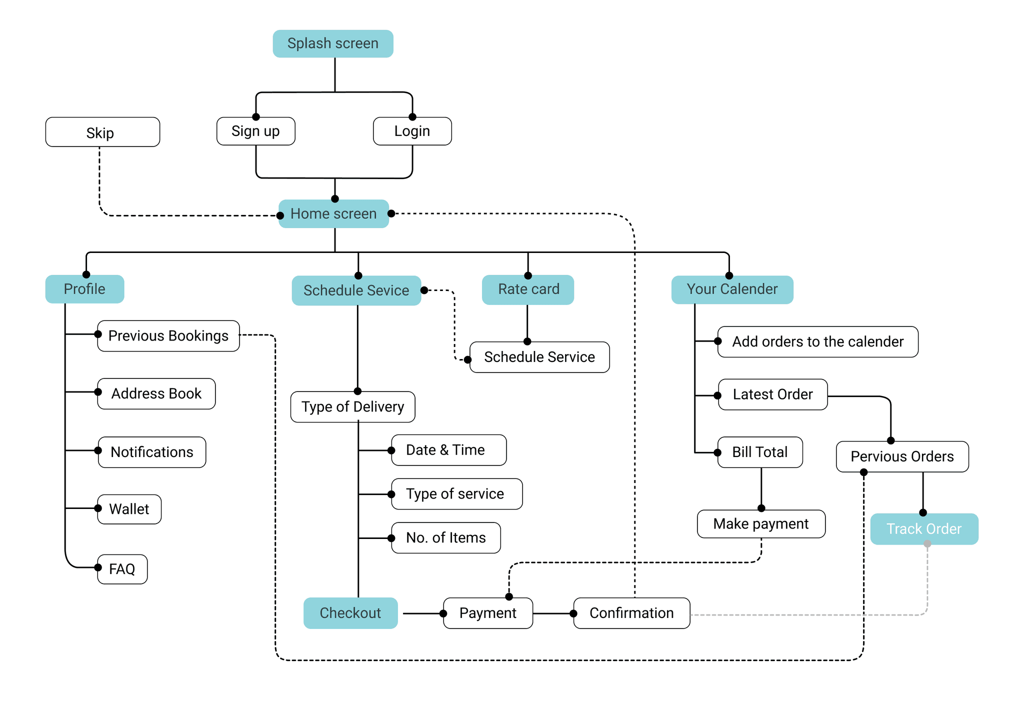
User Flow
By creating a detailed user flow, I visualized the entire user journey, identifying potential pain points and areas for improvement. This helped me optimize the process, ensuring a seamless and efficient experience for users.
Paper Wireframes
After establishing the user flow, I explored various solution options to optimize the validation process and address identified pain points.
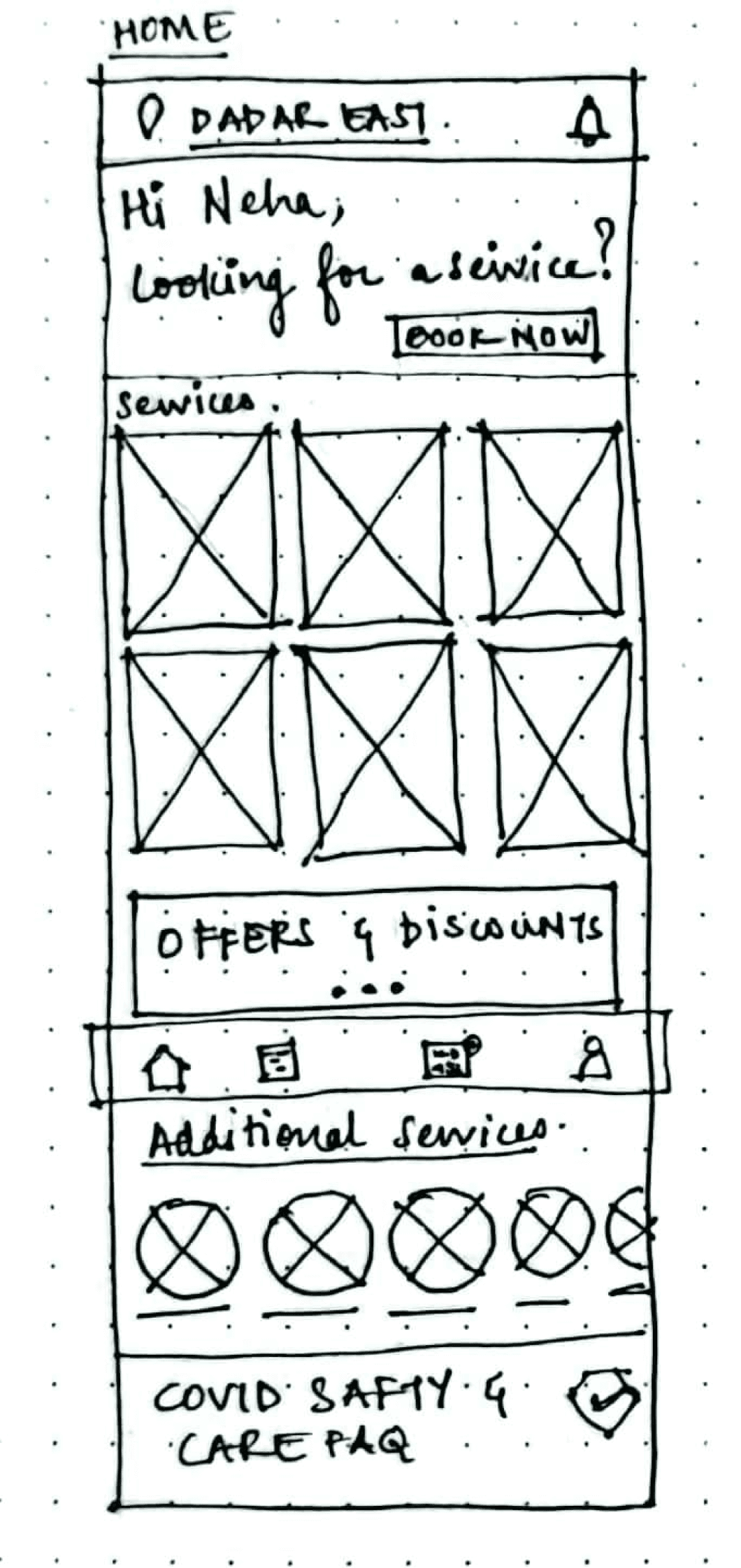
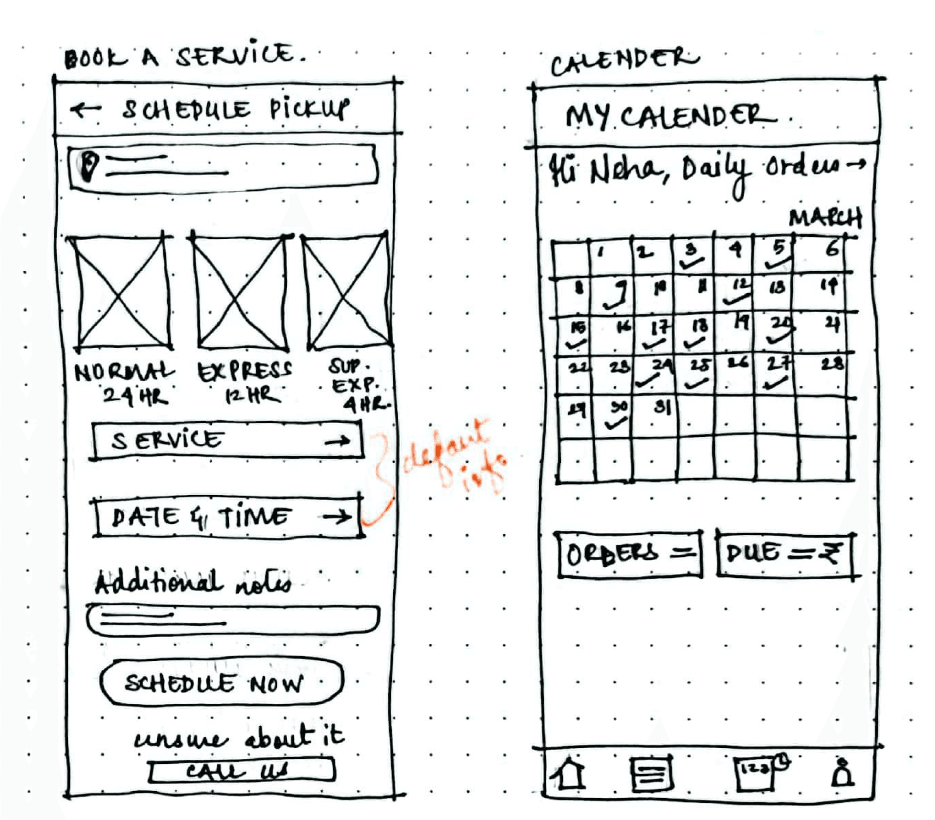
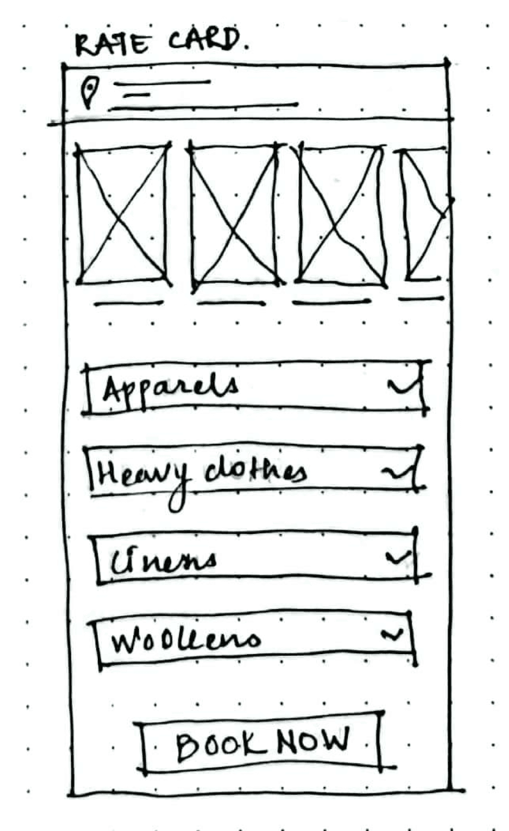
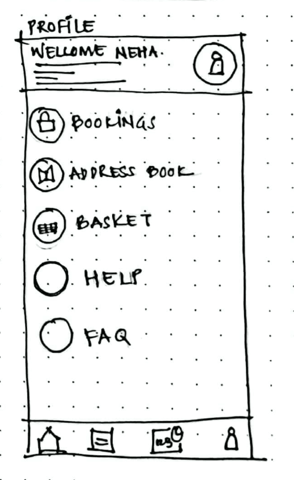
Low Fidelity
Prototyping
To gather valuable insights and validate design concepts, I transformed my sketches into interactive digital wireframes. These wireframes provided a tangible representation of the proposed validation flow, allowing me to test user interactions and identify areas for improvement before investing in full-scale development.
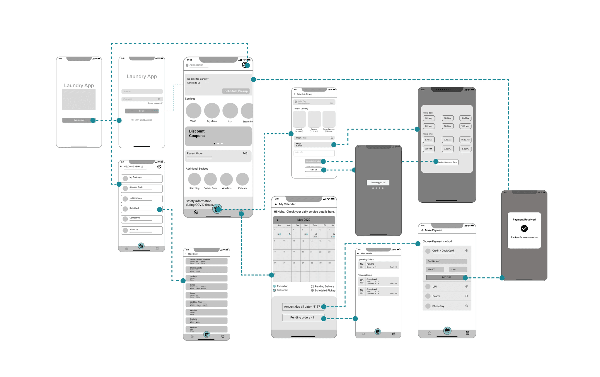
User Testing
Insights
After designing the lo-fi wireframes, I created a prototype and tested it with 5 participants. I made a research plan and outlined the goals, scripted the questions to be asked. 60% of the users could not complete the main task of scheduling a service. 40% could achieve it indirectly.
More than 60% of users were unable to complete the main task.
Direct Success
66%
Indirect
Success
34%
Style Guide
The color palette was inspired by the hues associated with laundry tasks, reflecting the everyday nature of the service.

Colors of cleaning products

Laundry Storage Baskets

Bubbles/ Water
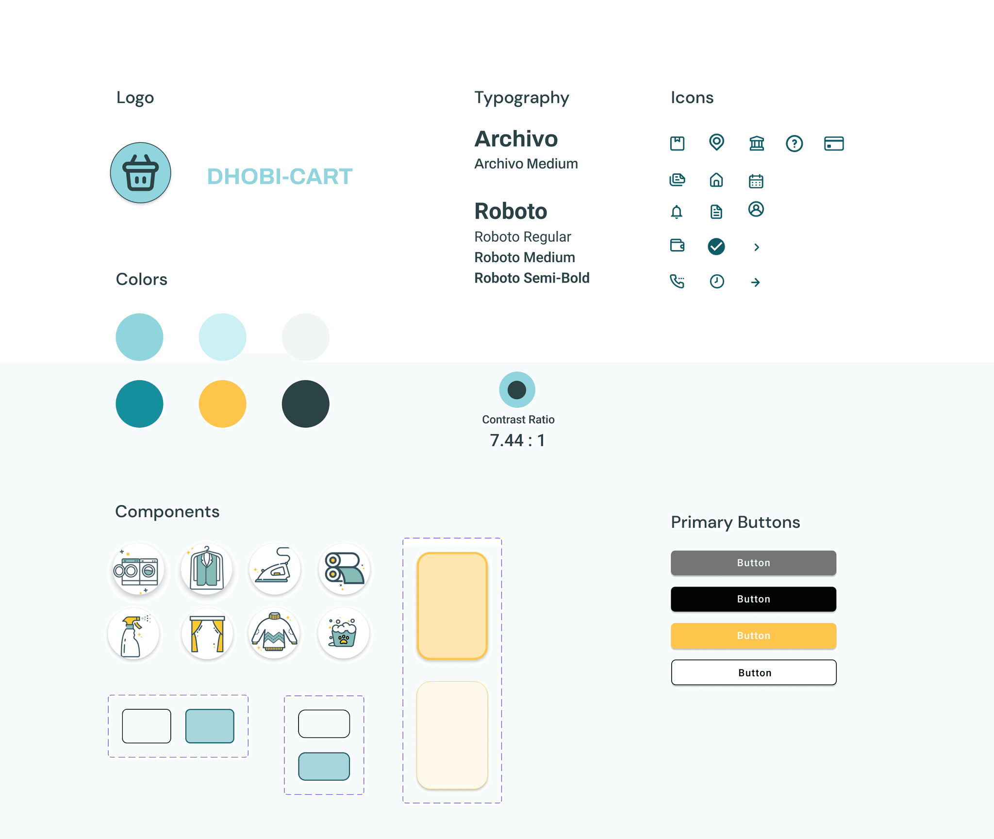
STYLE GUIDE
Final Design
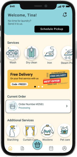
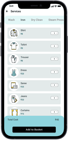
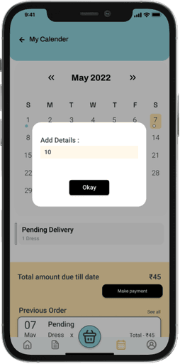
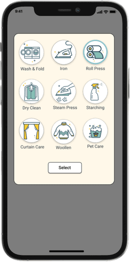
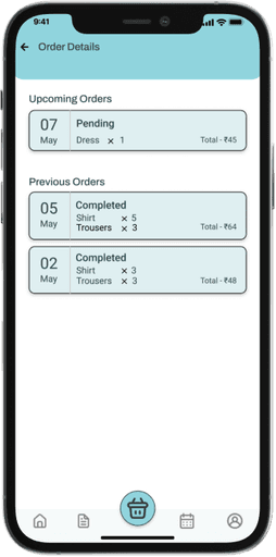
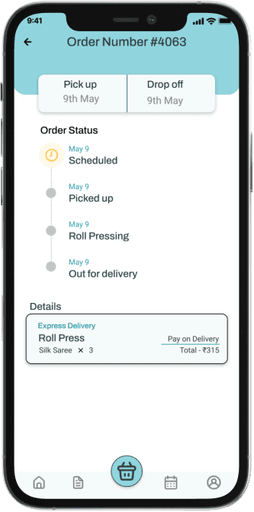
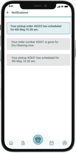
Once the wireframes were finalized, we created a comprehensive set of final designs along with accompanying style guides. These assets were then used for one last round of user testing to ensure the design met our usability and aesthetic goals.
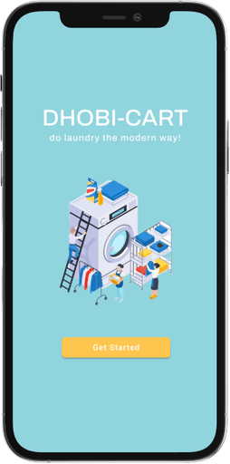
User Testing + Iterations
Following user testing of high-fidelity wireframes with a group of 5 participants, I implemented necessary iterations to refine the design.
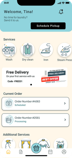
Task -
Despite everyone successfully scheduling a pickup, 60% faced initial challenges. Many users took a detour, clicking on 'services' instead of 'schedule pickup,' which added to the task time
Design Update -
The call-to-action button was redesigned for better visibility, and the notification tab was moved to the home screen for easier access
Task -
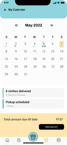
While all participants completed the task of adding data to the calendar, the small CTA button and confusing calendar interface led to a high error rate
Design Update -
The redesigned calendar interface was more intuitive and visually appealing, clearly displaying all input data. We also standardized the payment button to match the overall aesthetic.
My Takeaways
As my first user experience design project, I was excited to take it from concept to completion. This project taught me various methods to identify a problem space, narrow it down, and pinpoint areas for design intervention.
01
Thorough user research is essential for creating impactful designs. By understanding user needs, preferences, and behaviors, designers can develop solutions that are not only functional but also intuitive and align with real-world usage
02
A design might not operate how you expect it, taking a step back and reassessing your process will aid you in finding a solution. Being flexible lets you respond better to the unique challenges of each project and come up with more effective solutions.
03
While I had limited experience with design systems at the time, I recognize that leveraging the iOS design system would have enhanced the consistency and quality of my designs
