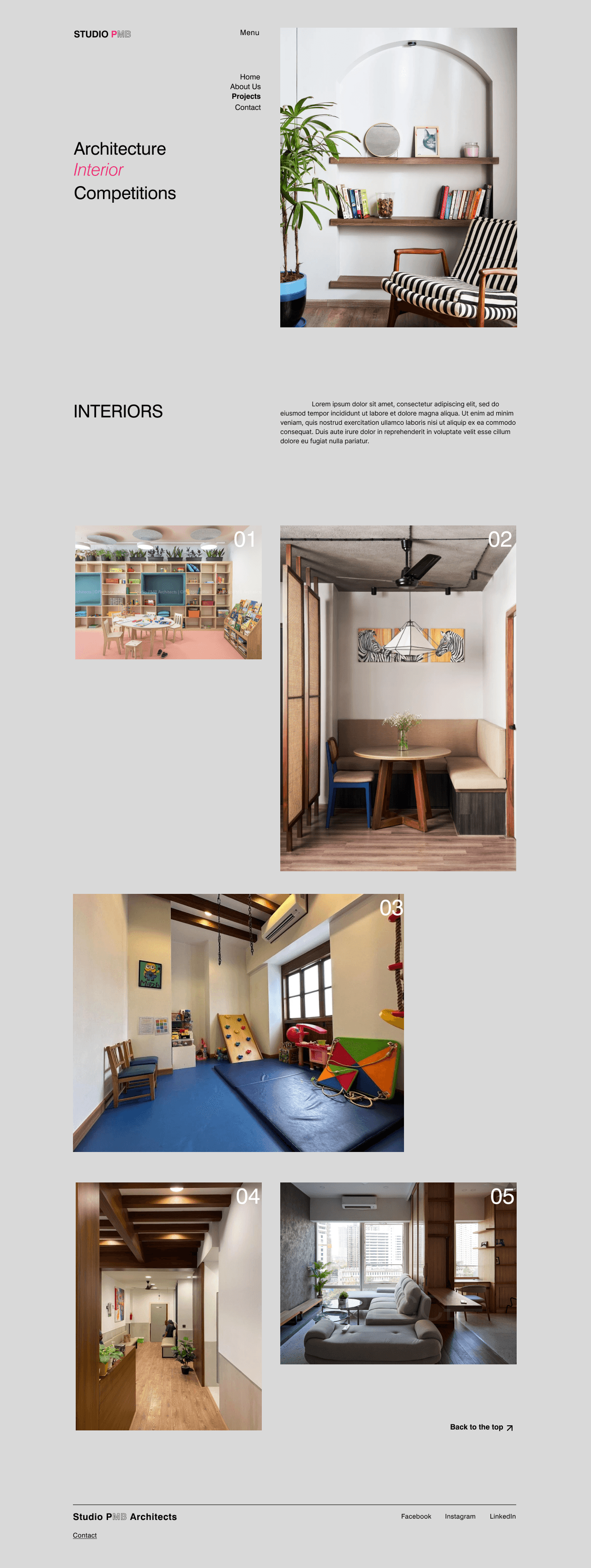
Creating a brand identity and portfolio for a Architectural Company
Shipped
Impact
My Role
Led complete brand identity and website redesign. Delivered brand guidelines, visual system, and portfolio website that balanced architectural sophistication with UX.
Client
Timeline
5 months
(Aug - Dec '22)

Recognizing the growing importance of digital platforms, Studio PMB Architects, established in 2017, sought to enhance their online presence. Despite a strong reputation built through word-of-mouth, the pandemic hindered business growth. The outdated website was unable to effectively showcase the firm's capabilities, necessitating a comprehensive redesign
The pandemic severely impacted Studio PMB's ability to sustain business through their existing website
Solution
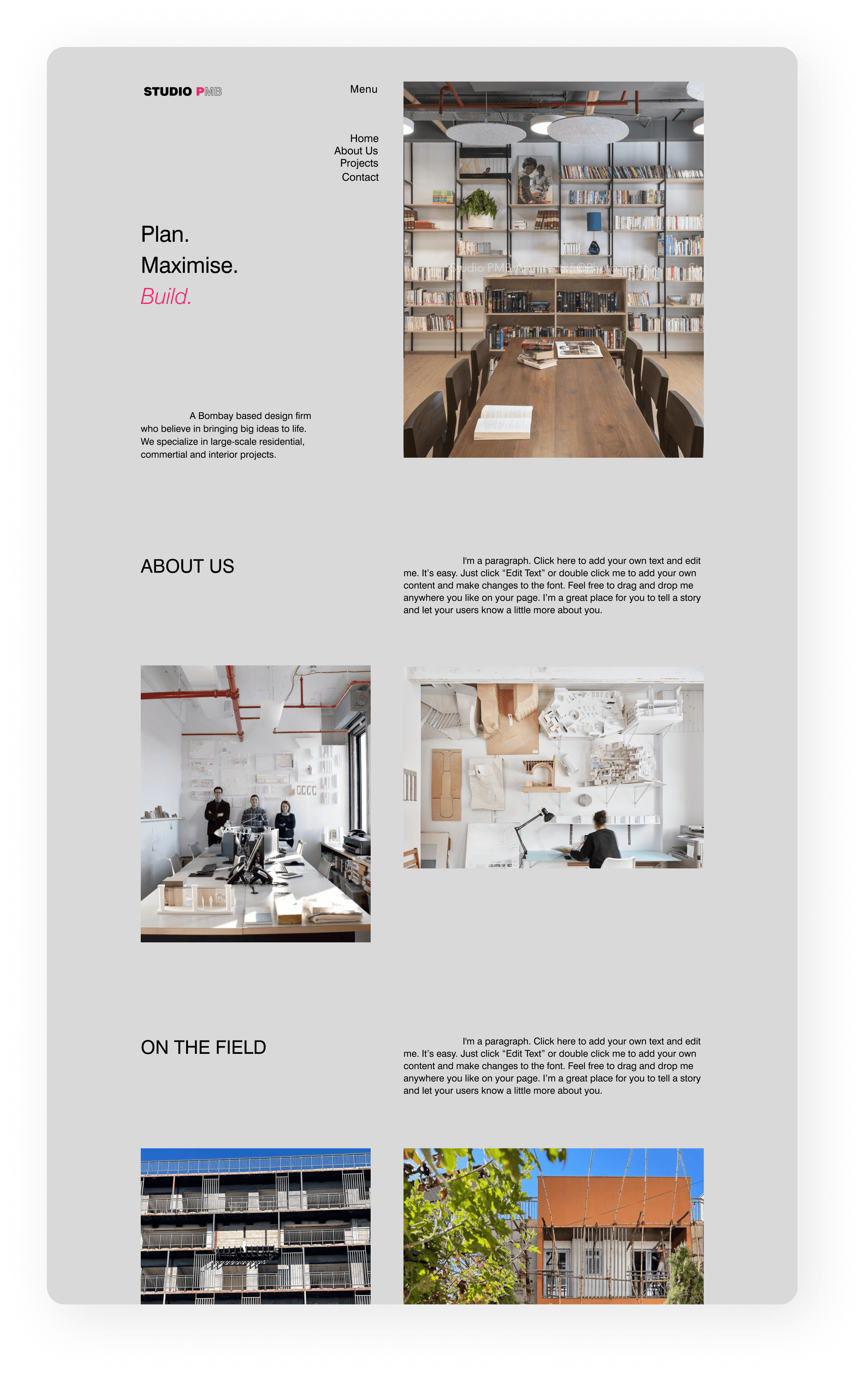
Studio PMB Architects needed a fresh brand identity to attract new clients. This included updating their logo, colors, and overall visual style
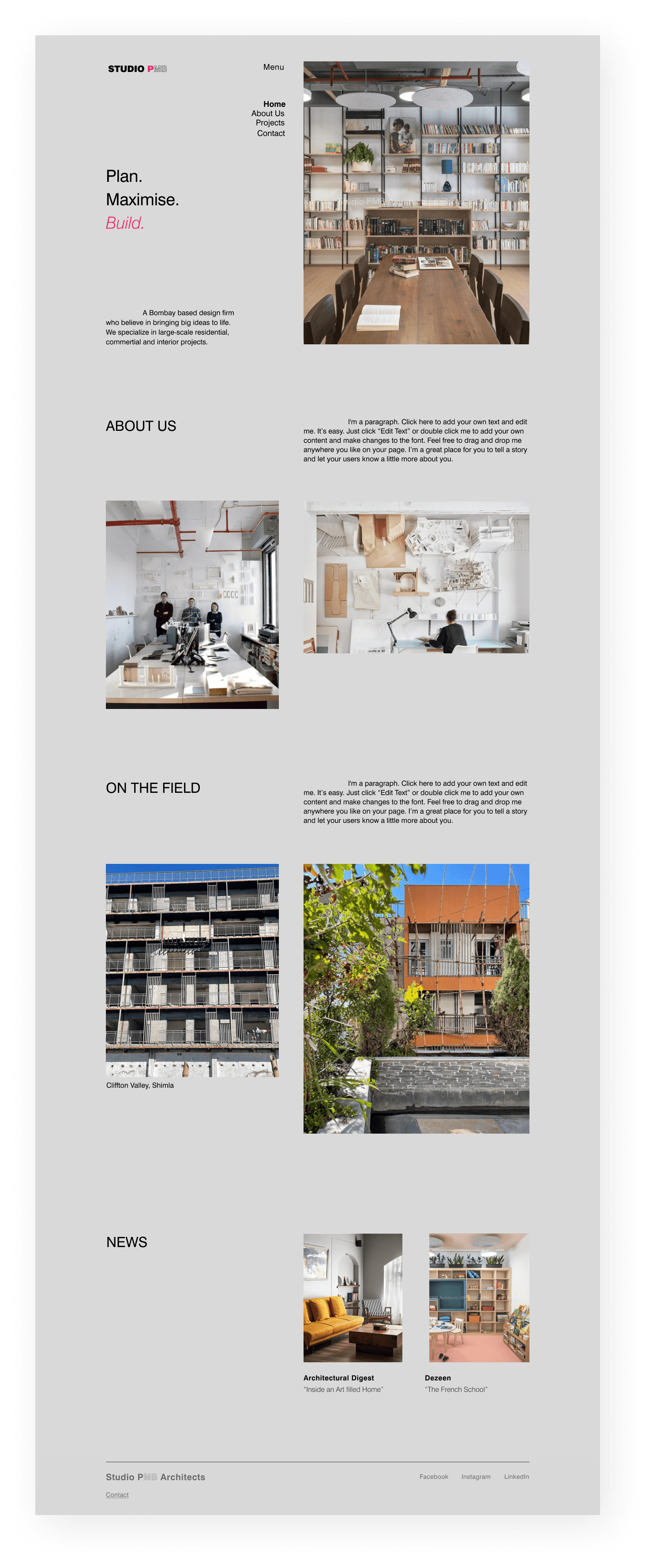
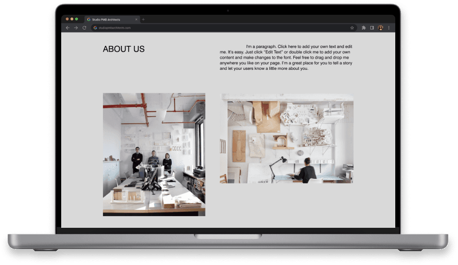
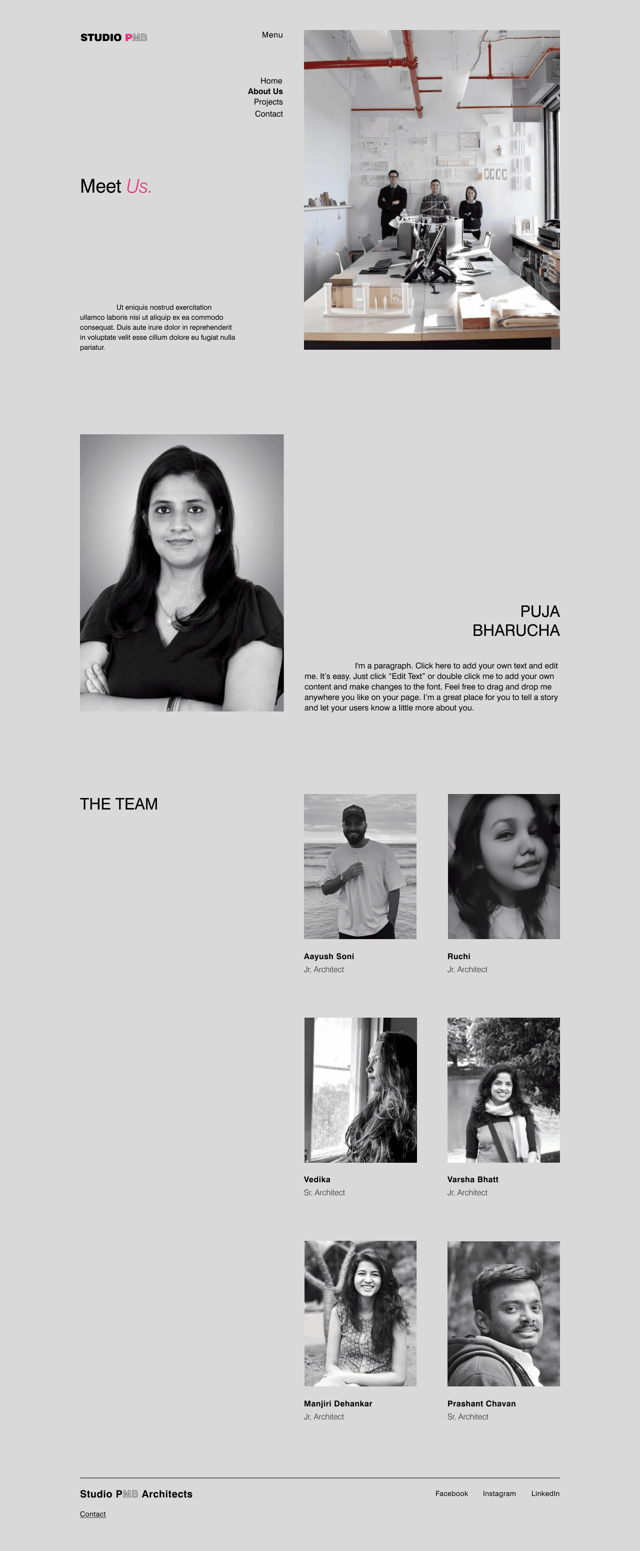
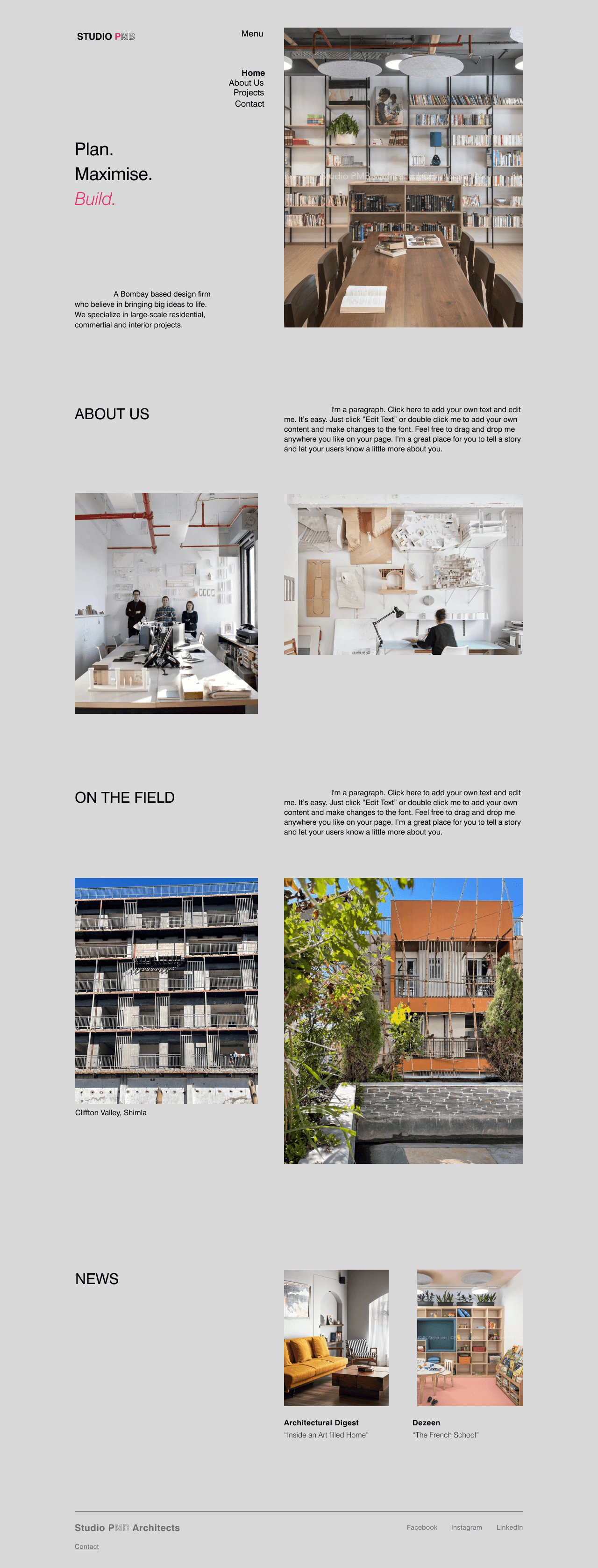
Revamping the Studio's website to reflect the company's ethos
Process
Before redesigning, it was crucial to understand the reasons behind the existing website not generating business.
Understanding
Client needs
Understanding the needs and goals of the client was crucial because this project was going to highlight the achievements of the architectural business.
Goals
Create Brand Identity
Website needed to accurately reflect the client's brand identity and core values, effectively communicating their USP
Online Portfolio
Website should serve as a powerful marketing tool, showcasing the firm's portfolio and attracting new business opportunities
Generate Traction
Website should be an online portfolio that would not only attract new business opportunities but also attract top talent to the firm
User Testing
I conducted user testing among 10 users on the existing website virtually to to recognize the challenges users encountered when navigating the studio website
Common pain points —
"I thought the website belonged to a different studio based on the colors and the branding"
"I was confused because of the template photos on the website"
“The navigation on other pages does not work, I was stuck”
Analyzing the
existing website
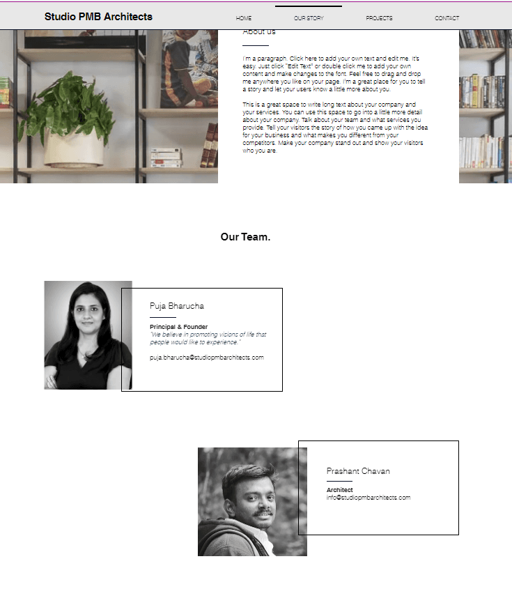
To identify additional areas for improvement, I conducted a comprehensive analysis of the existing website, emulating the user experience
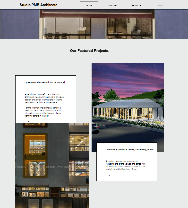
Unable to navigate to
'our story' page
Read more arrow doesn't work
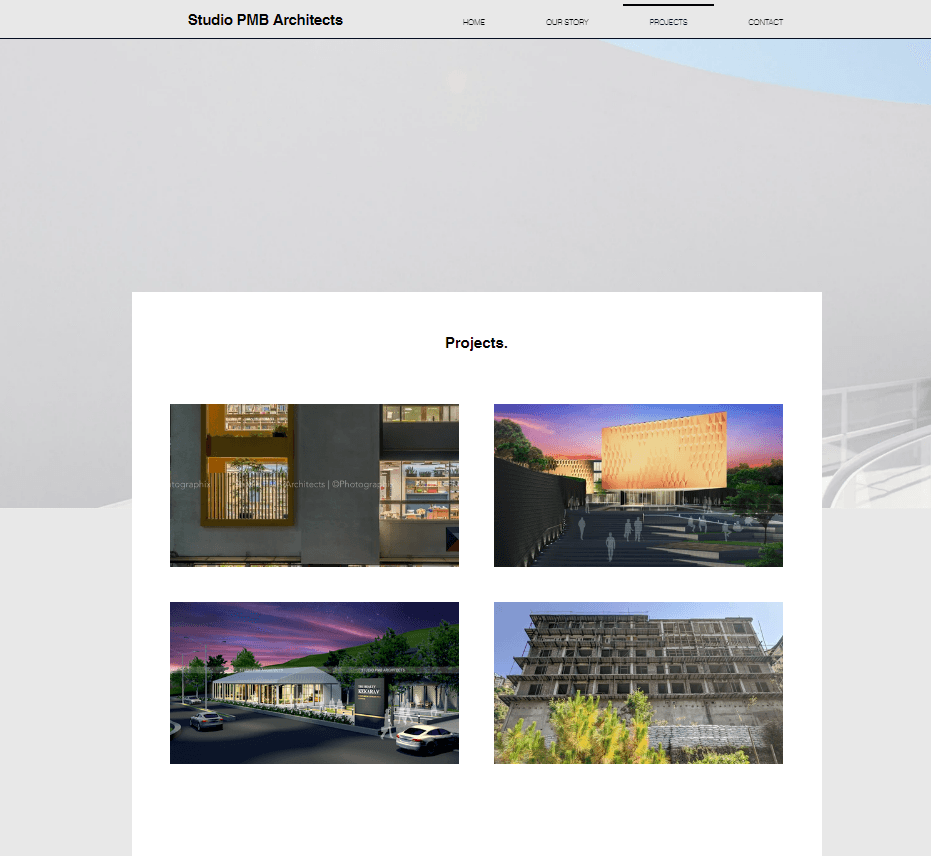
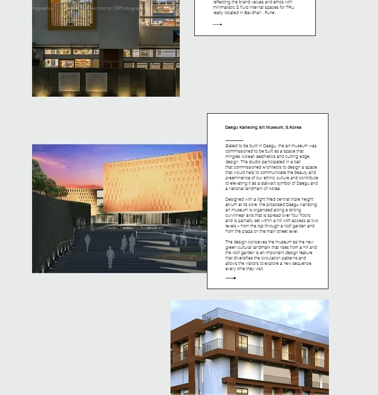
Confusing layout and
images
Unrecognizable studio branding
Inconsistency through-out the working pages
I conducted interviews with 5 participants, 2 of them had a background in architecture, and the remaining were potential clients. Through the interviews, it was clear that the target demographic was between the ages of 19 and 45.
To enhance our understanding of the target audience, I transformed the collected data into in-depth user personas
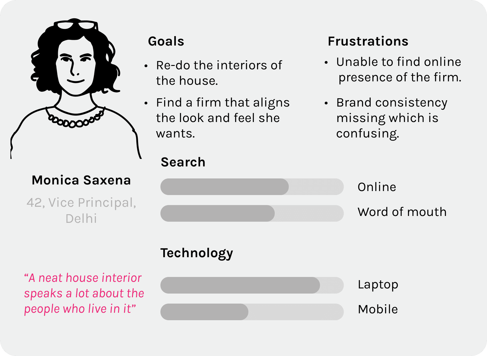
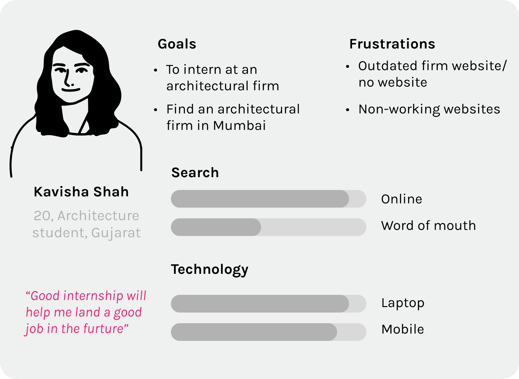
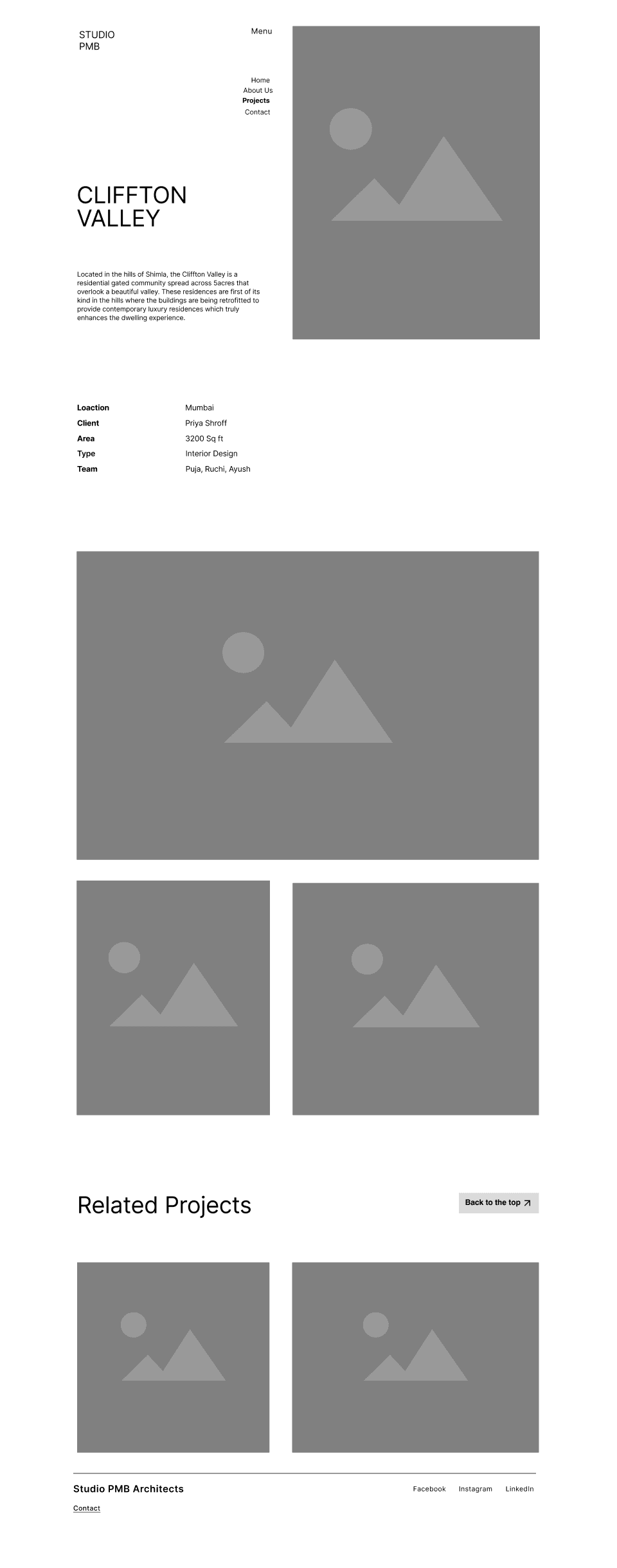
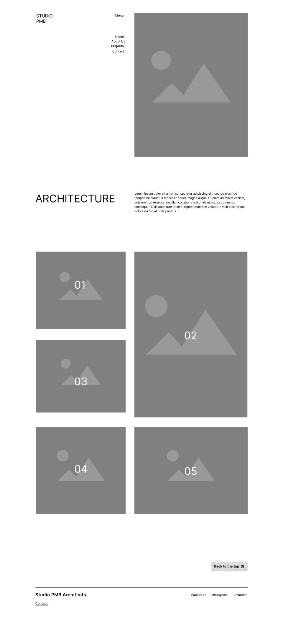
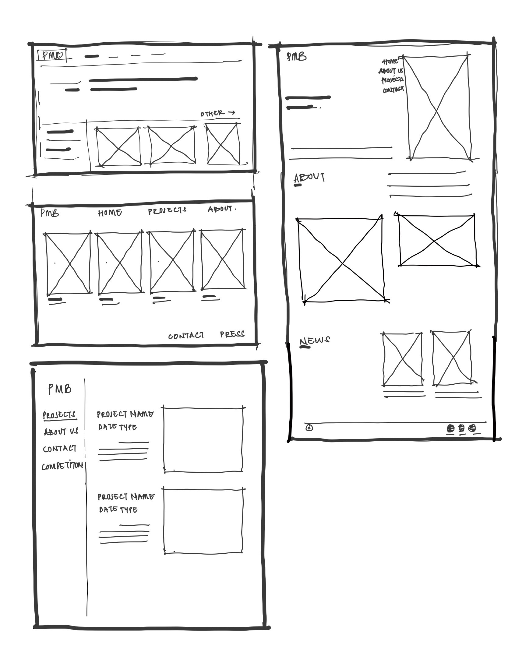
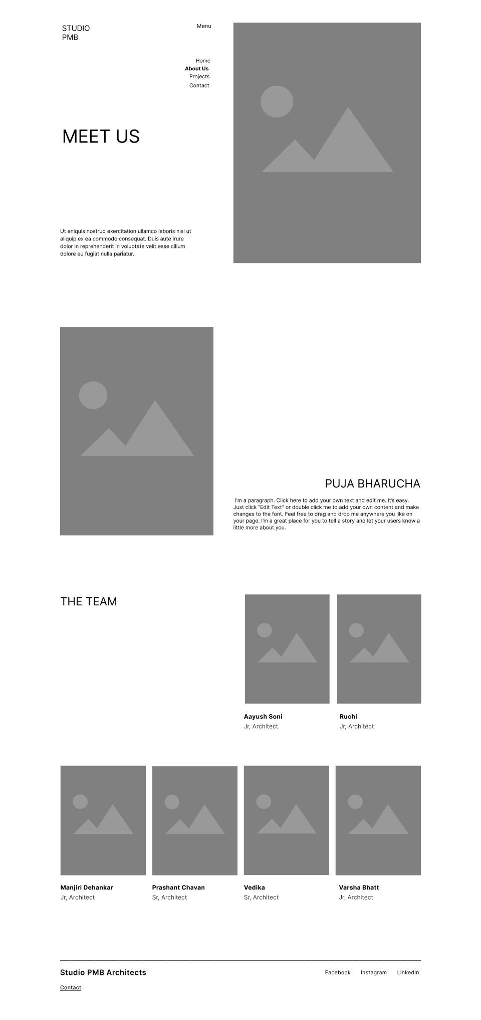
Information Architecture was an important step in the product development journey. Based on the old website which had no connection within itself, it was crucial to note the different kind of pages and their interconnection for a smooth user experience.
Being able to restart the journey at any point without having to exit the web browser was something that was stressed upon.

The company was looking for a unique website that could also convey the studio’s personality. The original concepts that were discussed were peculiar and unconventional.
I used an innovative and artistic design approach to solve this problem.
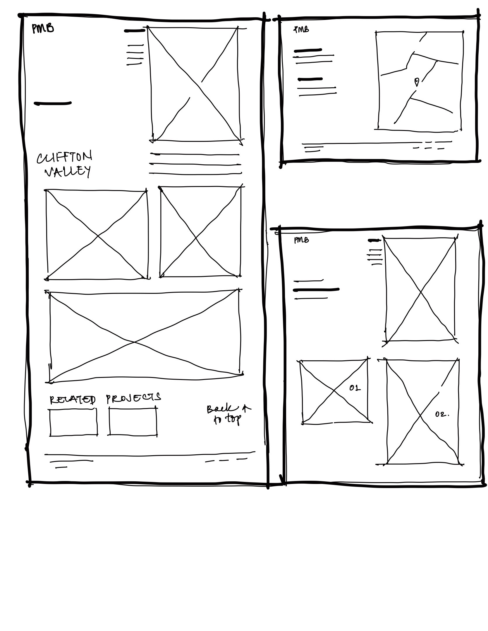
Given the unique design of the website, user experience testing was crucial to assess its usability. The testing aimed to determine if users could easily navigate between pages and find the information they needed to complete specific tasks
I used an innovative and artistic design approach to solve this problem.
No navigation
Text illegible
Cannot find other
categories
It was pertinent to rebrand the website in order to maintain consistency across all online platforms and accessories connected to the business.


A/B testing was conducted by randomly assigning participants from a diverse age group (20 to 50) to either Version A or Version B.
Participants were asked to explore the respective prototype and provide feedback on various aspects, including:
Visual Appeal: How visually attractive and engaging did the users find the design?
Communicating brand identity: Did the design effectively convey the studio's brand values?
Portfolio Presentation: How well did the design showcase the studio's work and projects?


Version A
Version B
This graph represents quantitative data, such as click-through rates, time spent on the page, collected along with qualitative feedback from participants.
Most of the users, found Version A to be most associated with the parameters posed above.
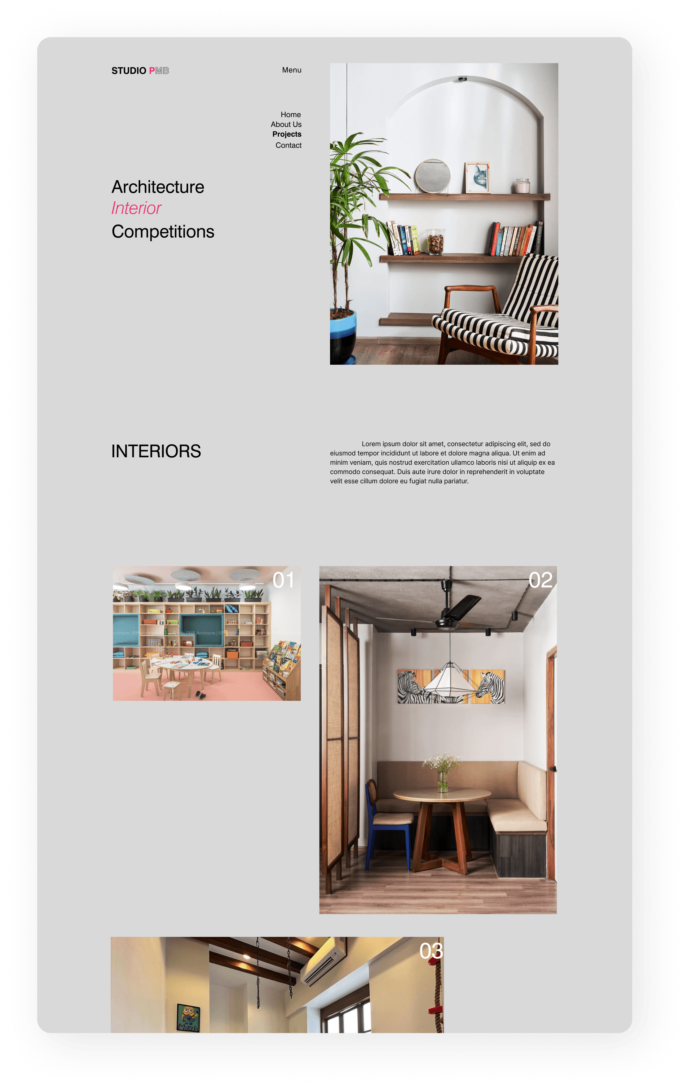
The best way to communicate building designs is with the aid of high-quality project photos. Negative space and picture placement were given careful consideration in order to keep the focus on the main subject.
The old page did not convey clearly about the firm and their philosophy.
The earlier website did not have projects categorized in a systematic fashion, therefore it was confusing for the users to decipher in one glance, without reading.
Impact
After launch —
2x ↑
client
The redesigned website demonstrated immediate success, converting 7 leads into potential clients within the first week
32% ↑
traction
Following the website redesign, online engagement surged substantially, with metrics such as website traffic, time spent on site, and page views experiencing significant increases.
This project allowed significant creative freedom to experiment with unique design directions. However, I learned that solely pursuing novelty at the expense of functionality is counterproductive. While an innovative approach is valuable, adhering to established UX principles is crucial for crafting an optimal user experience.
01
Leveraging stakeholders' existing user research can help designers avoid redundant efforts and ensure designs are aligned with accurate user insights.
02
While my initial focus was on creating a modern aesthetic, I now recognize the importance of prioritizing intuitive navigation to enhance usability.
03
Incorporating SEO best practices and optimizing for mobile devices would have enhanced the website's visibility and reach
